A rebrand to stay current is a ritual many corporations go through every several years. Things move fast in the world of branding and consumers seem to embrace and appreciate more modern branding as time moves forward. Some brands we know and love had their logos and brand identity updated to reflect modern design trends. Here are 10 examples of major corporation logo redesigns that I find to be fantastic efforts.
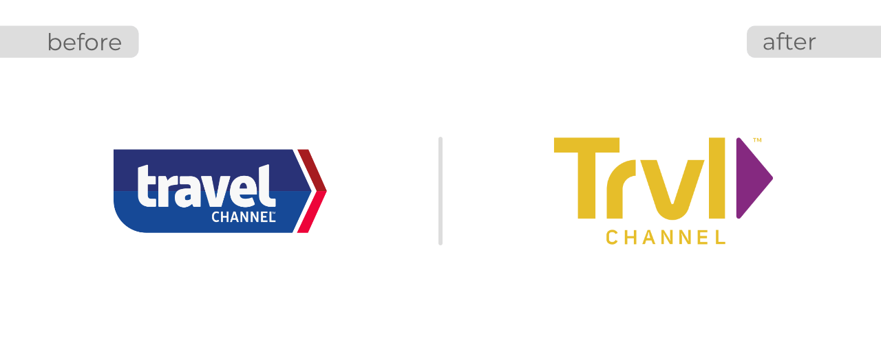
1. Travel Channel
Travel Channel updated their logo in October of 2018 when they moved their focus more on paranormal and unsolved programming. The updated logo gives a more simplified look and feel with clean lines and a complimentary color palette.
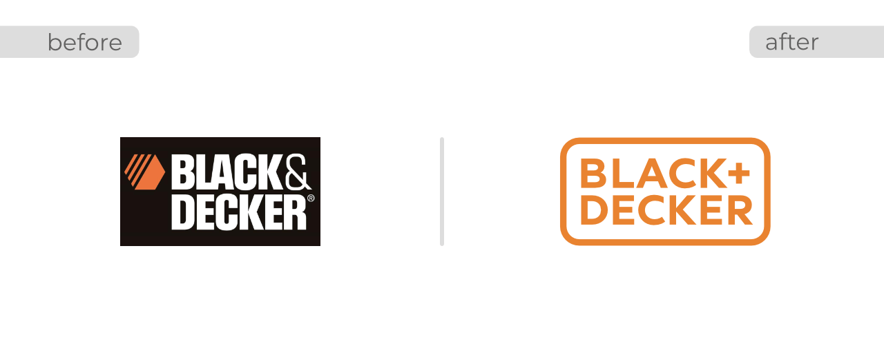
2. Black + Decker
Black+Decker updated their brand to reflect their new focus of home products. Design firm Lippincott developed their new logo and I think they did a stellar job. Moving away from the classic hex iconography and towards a simplified use of font and the “+” element is effective to include their full range of products.
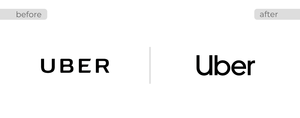
3. Uber
The design firm of Wolff Olins updated Uber’s logo in 2018. On the left is the 2016 version of the Uber logo. Again, simplicity is key here and this logo is effective at small sizes for mobile phone screens.
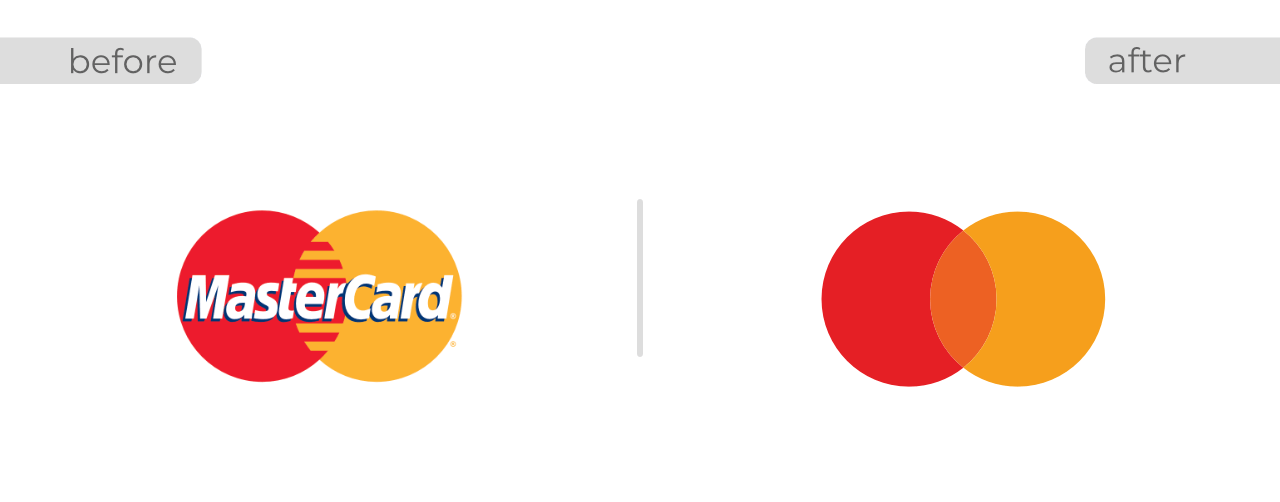
4. Mastercard
The design firm Pentagram has done a fine job here for Mastercard. By removing the wording from their logo this iconic brand has become more, well iconic. Michael Beirut at Pentagram says “Now, by allowing this symbol to shine on its own, Mastercard enters an elite cadre of brands that are represented not by name, but by symbol: an apple, a target, a swoosh.”
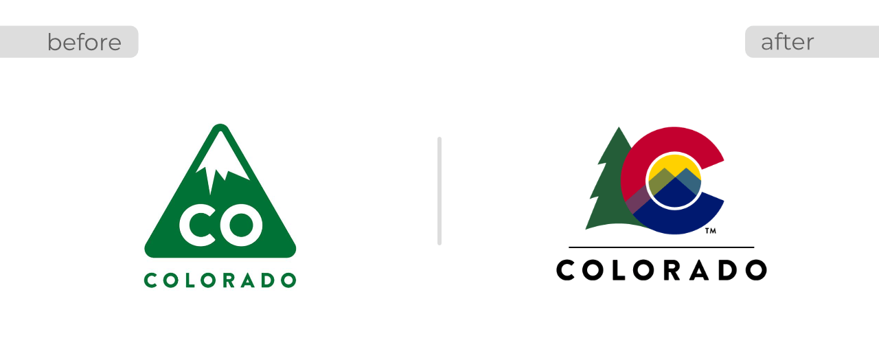
5. State of Colorado
Being my home state I had to include this one. 2019 marks the redesign of the state logo from the previous green triangle created in 2013. While I was a fan of the green triangle it seemed to over-simplify the state. Discussing the new logo, Colorado’s Governor Jared Polis said in a press conference “The green tree represents Colorado’s natural resources and spirit, the red represents the red soil and rocks, the yellow represents the state’s abundant sunshine and wheat of the Great Plains, the blue represents water, the lifeblood of our state, and the two peaks represent our many mountains.”
6. Firefox Browser
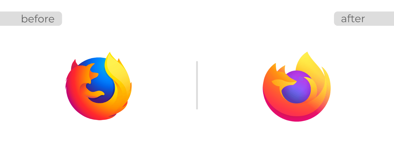
As part of a larger, universal rebrand for Firefox the browser icon was updated in 2018. As a web designer and developer I see these browser icons every day so I appreciate a good redesign. While not a major change, this new design does streamline the logo a bit more and really brings out the vibrant colors with the use of a complimentary color palette.
7. Audi
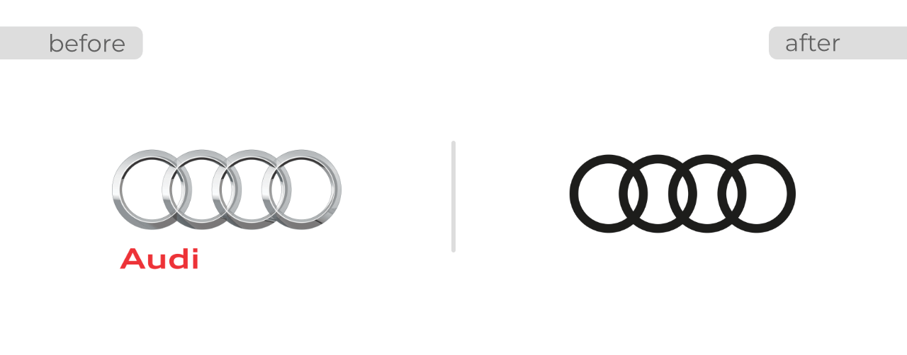
Audi updated their logo in 2016 to the flat rings. Removing the Audi text from the logo enables this to be used as a symbol anywhere and at any size and still be recognizable. This is an excellent example of flattening and simplifying a logo design.
8. Fitbit
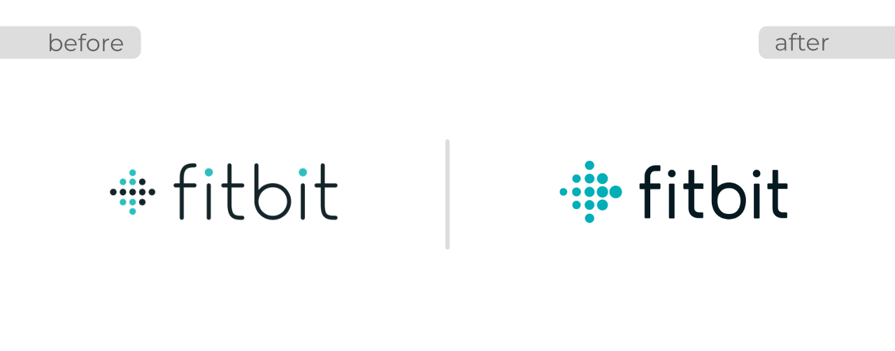
2016 also saw Fitbit update their logo. Although a slight change from the former, it is still effective in that increasing the thickness of the text makes it more legible at smaller sizes. By moving to a separated, two-color palette it also helps to reduce visual clutter in the previous version.
9. Celestial Seasonings
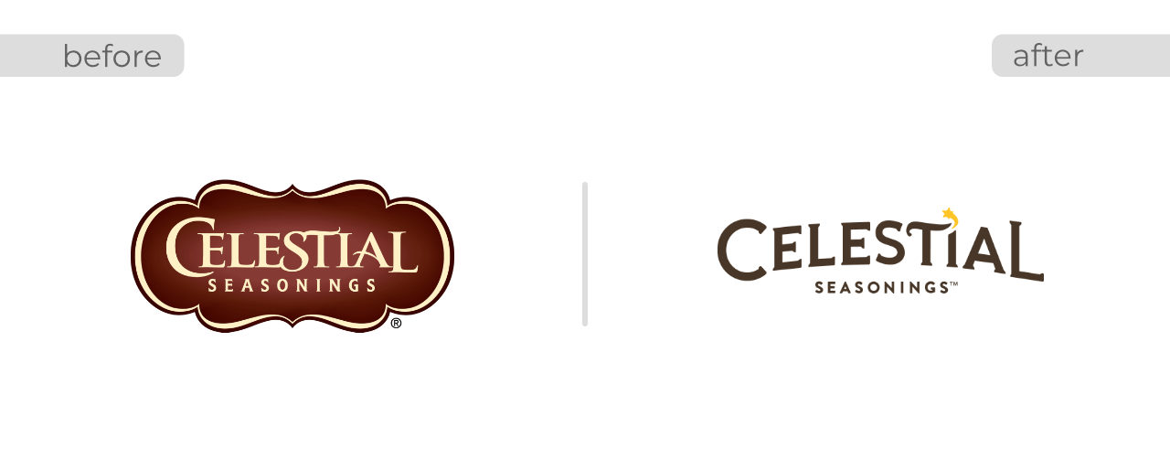
Boulder, CO based Celestial Seasonings modernized their logo with the help of Tether. In an interesting twist, after the new logo and packaging were released onto store shelves there was poor customer response and Celestial Seasonings reverted back to the previous logo and packaging. I happen to like the new logo but you also want to do what is right for your business and your customers.
10. Animal Planet
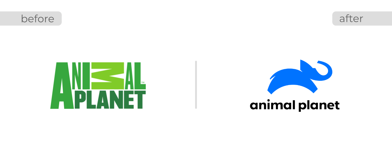
In 2018 Animal Planet updated their logo with the help of design firm Chermayeff & Geismar & Haviv. I like this redesign because it incorporates the majestic elephant, the curve of the earth, and the blue of our planet’s water. The result is a fun logo that is easy to read and summarizes the mission of the brand.
Are you rebranding your business or starting a new one? Seamless Creative can help with your logo design project. You can learn more about our graphic design services and see our client work.
Add your comments below to discuss or share with us your favorite logo redesign.